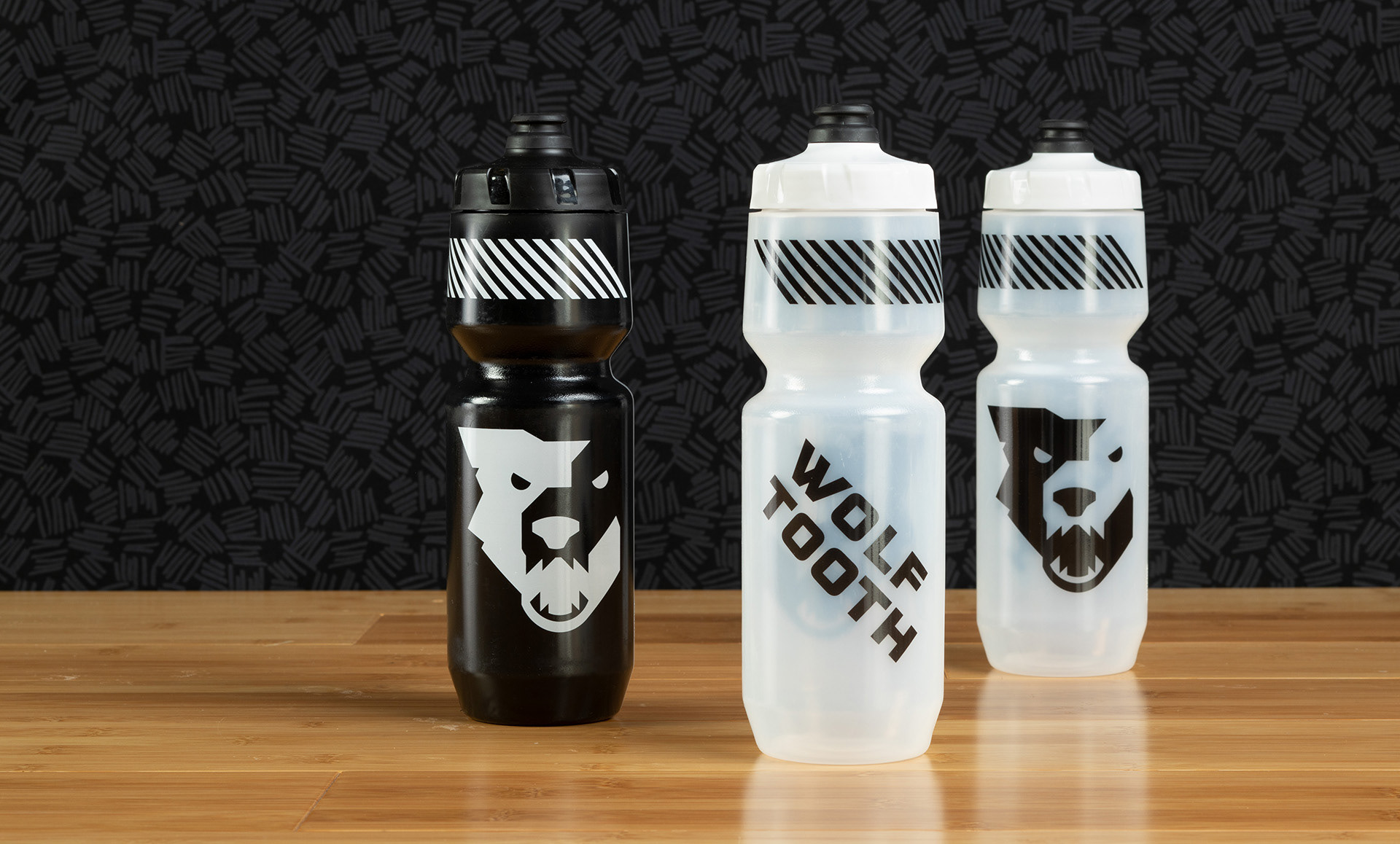
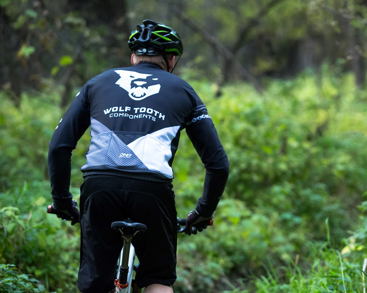
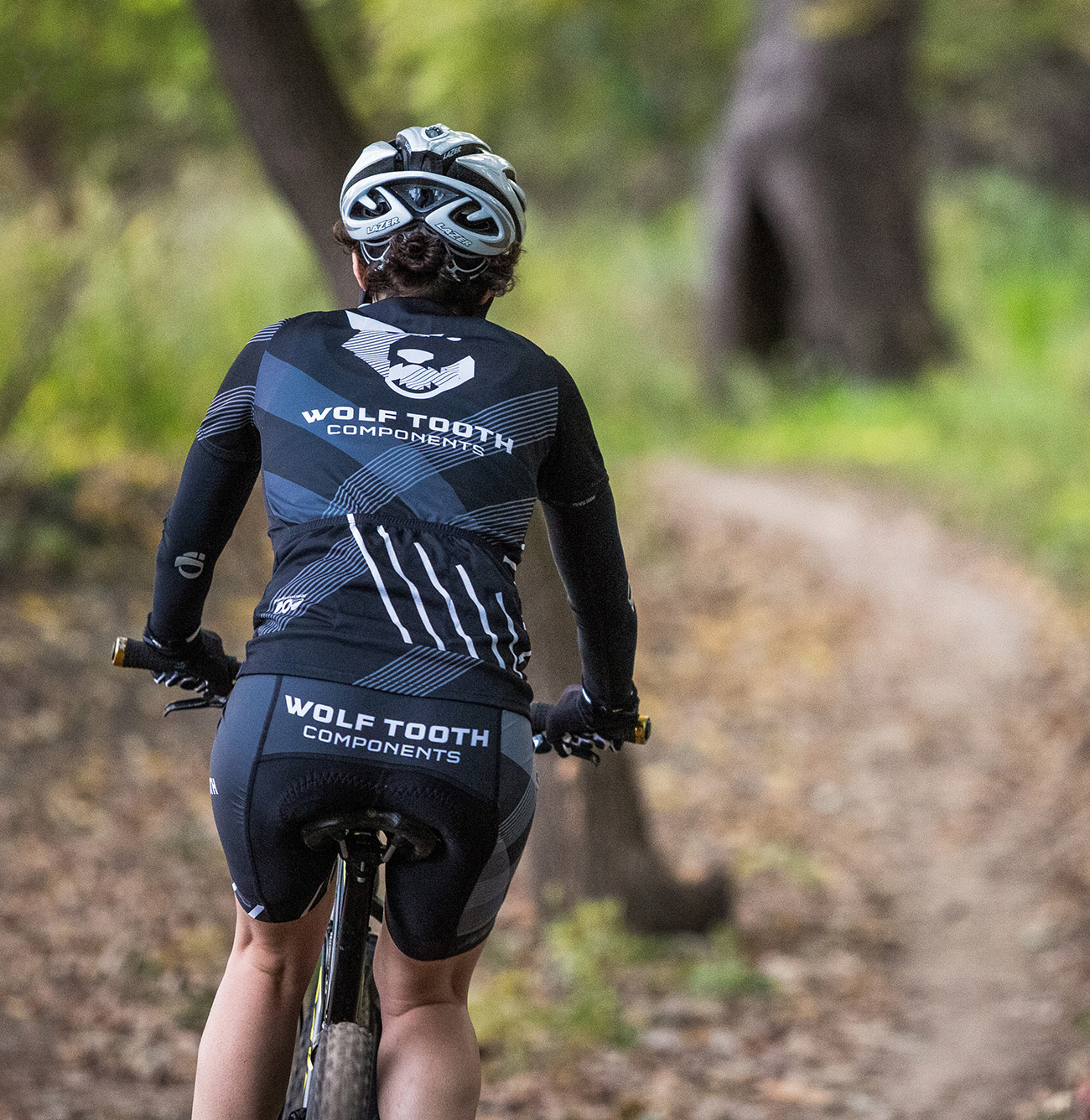
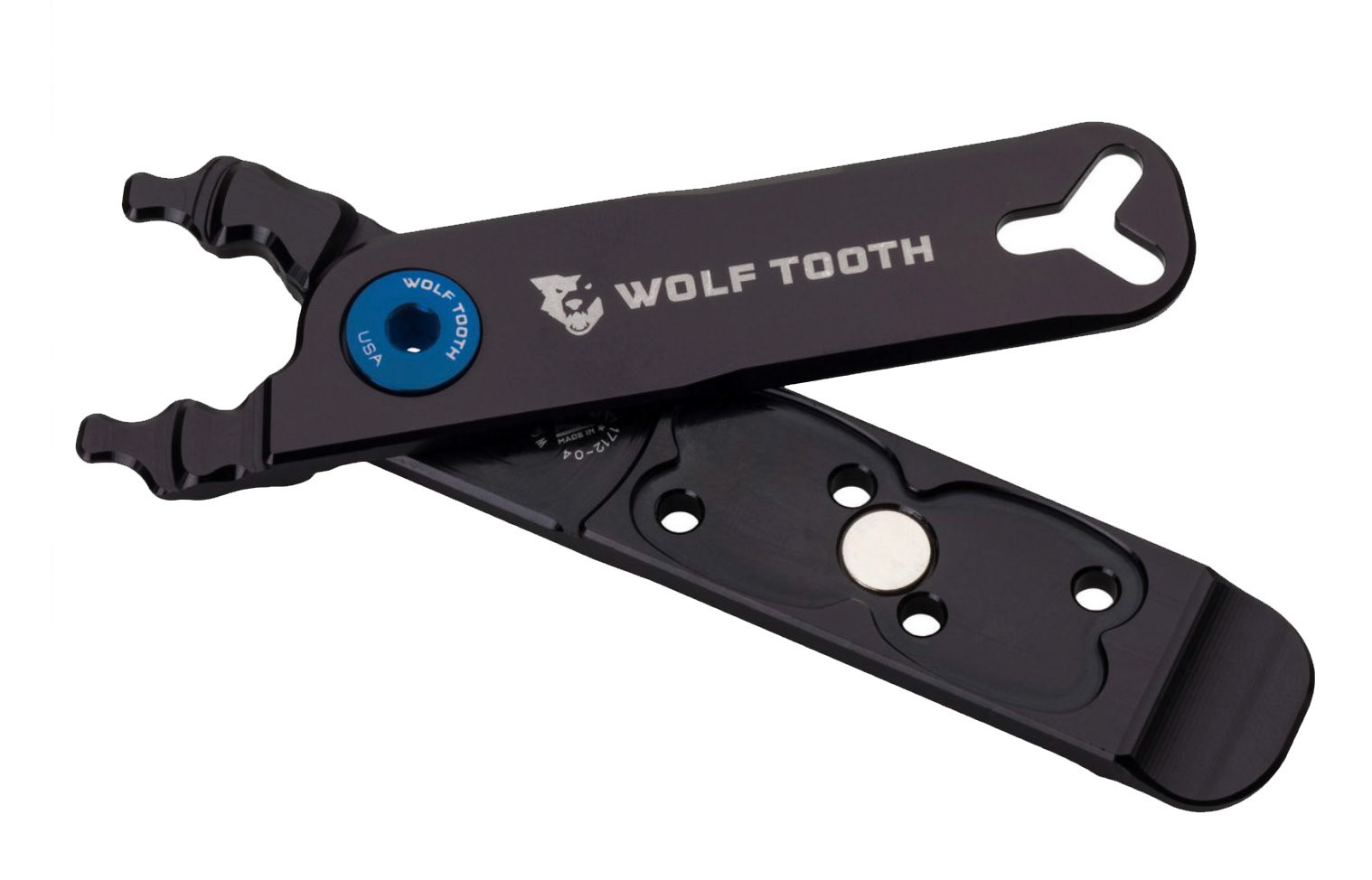
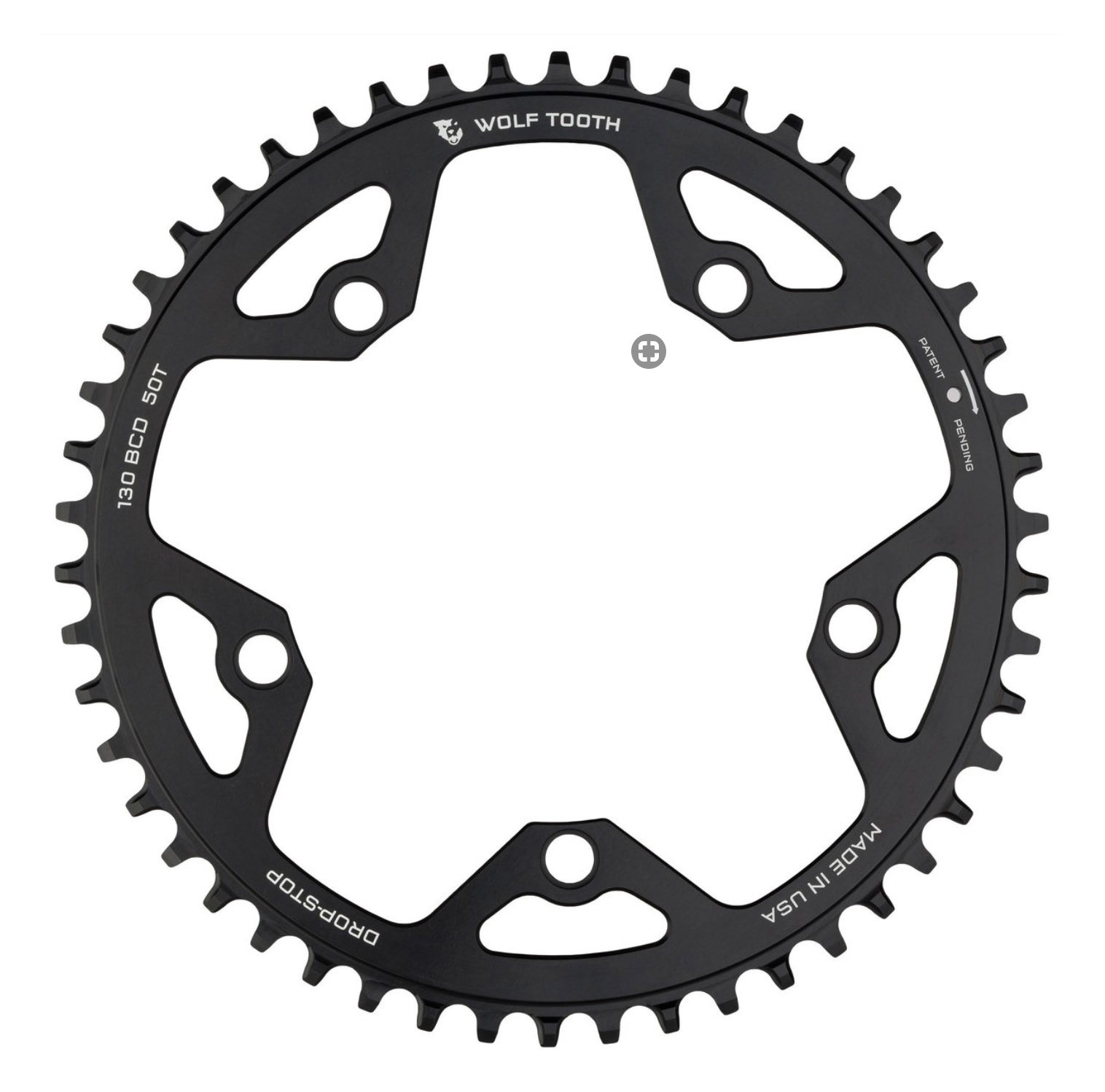
Wolf Tooth is an award-winning components and accessories company, based on the innovative design and precision engineering of niche cycling products. I designed its logo, all the initial brand elements, packaging, apparel, and more. The wolf head is extremely popular on schwag— the company goes through 50,000 stickers a year, and one super fan even requested permission to have it tattooed on his body!

HONORS: The Wolf Tooth packaging system won an AIGA Minnesota Design Show award.
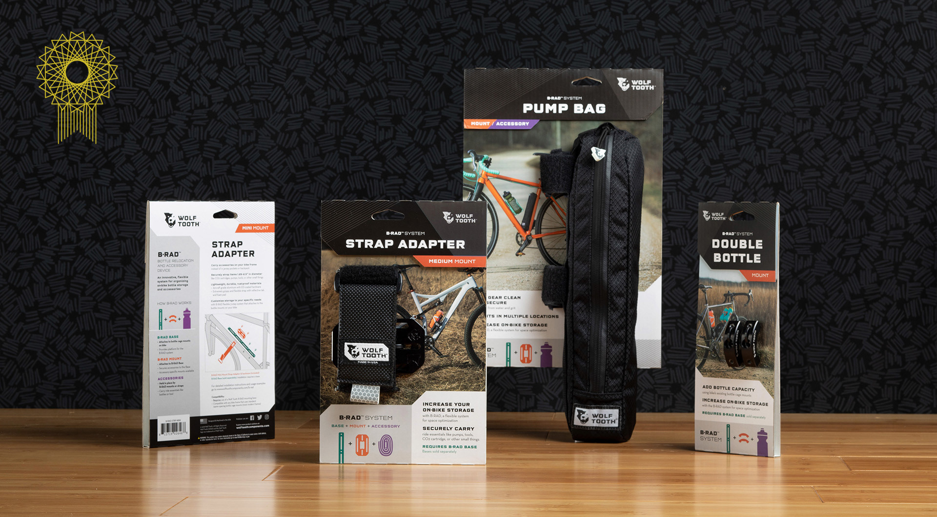
Packaging Overhaul
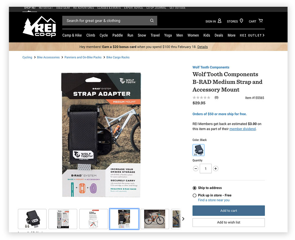
Early sales of Wolf Tooth products were mostly special orders, so shelf appeal wasn't a concern. As the company expanded it began to receive greater attention from shops. REI expressed interest, with the condition that the packaging had to improve.
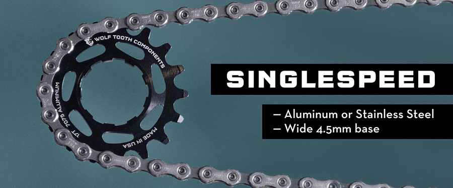
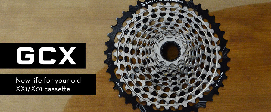
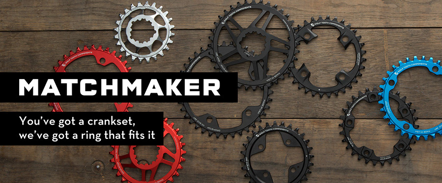
The challenge was to make the products approachable to a wide range of cyclists, not just those who read gear blogs. All decisions we made support telling the story of the product: Exposing the product allows a shopper to see and feel it, which helps convey the quality. A friendly photo supports at-a-glance understanding of what the heck this thing is. Copy informs without overwhelming, and brief instructions show ease of installation. The sharp palette and angular elements stand out on the shelves in relation to other cycling brands, and draw the eye to key information.
The challenge was to make the products approachable to a wide range of cyclists, not just those who read gear blogs. All decisions we made support telling the story of the product: Exposing the product allows a shopper to see and feel it, which helps convey the quality. A friendly photo supports at-a-glance understanding of what the heck this thing is. Copy informs without overwhelming, and brief instructions show ease of installation. The sharp palette and angular elements stand out on the shelves in relation to other cycling brands, and draw the eye to key information.
REI was very impressed and now stocks the brand. Many other retailers have also expanded their orders and have seen increased sales because of the display-friendly packaging.